Friday, September 28, 2012

First Official Portfolio Painting

I must apologize for skipping out on last week's blog post. It has been a crazy first couple of weeks back to school! To make up for it, this week's blog post is especially insightful. Furthermore, you will be able to see the progress of a complete piece of work, not just conceptual sketches and studies.

 After sculpting the muscular forms of my creature, I begin the tedious process of adding "feathers" to the body. I start at the bottom and overlap in spiraling rows. I make sure that the feathers radiate out from their point of contact, which is especially noticeable around the rim of the chest hole. The feathers reveal more about the form underneath this way and look nice and ruffly.


The complete maquette! The head needed an external support because the skeleton underneath was made too thin in my haste. The head is about 90% sculpey as opposed to the body, which is maybe 15% sculpey and 85% foil with tape wrapped around it.


Here is the drawing on watercolor paper. I put about 2 layers of gouache on the background and started rendering the image inside the hole. I discovered that gouache should not be painted on such a small scale. I used the smallest brushes in my possession and it still takes several layers of paint and several layers of "lifted" paint (mostly by accident) to get the smooth transitions I want.

One significant change I made to my composition was the removal of the apple in the eye. I was working with two pieces of figurative language, the other being "in the shadow of your wing". I felt that a much stronger composition could be created by focusing on just one of those images to represent literally. I could create a stronger narrative that does more to represent Psalm 17 without the unnecessary attention given to the apple-eye.


I took a break to put a layer of transparent gouache on the rest of the creature.


I fleshed out the feathers with one layer of semi-opaque white gouache per feather. This took no time at all from having a detailed sketch to work off of. When I drew and painted the feathers, I did not dare replicate exactly what was in my reference picture, but used the information it gave about "cast" shadows. These are the dark shadows created when an object is lit by a strong light source. Depending on the angle of the light, these can be long shadows that can be hard to reproduce from the imagination, especially when they are cast on a curved form, such as the cast shadow from the left head-wing that curves around the neck.

As far as my experimental sponge-palette is concerned, it is working very well. It does not keep the outermost surface of my gouache paint from drying while the tupperware lid is off, but I keep it pretty moist with a tiny spray bottle. I imagine you would not need to do this if you had smaller quantities of paint, which leads me into researching how I can make my own gouache paint. I certainly wouldn't have to remix my paints and make large puddles of goop in the process if I could just squeeze out a tiny bit from a tube at a time.

Monday, September 10, 2012

How to Prolong the Life of Your Gouache

I saw a brilliant post on http://comictool.blogspot.com about how to create a magical palette that keeps your gouache paints from drying while painting and especially while storing. It is likened to the Masterson Sta-Wet Palette, but uses materials found at your local grocery store and is quite inexpensive! Here's what I did:


I bought the three packs of sponges (4 in each) for a total approximating $7. I actually end up using only two of those packs, which is 8 sponges. Those 8 sponges filled 7 of the 3 x 3 in. bottomed Tupperware containers and 7 of the 2 x 2 in. bottomed Tupperware containers. I found those Tupperware containers at the 99 Cent store at 2 (the small and the big) for 99 cents! I thought I would end up using the smaller containers for paint storage, but I think now that seven of those larger containers will be just fine for that purpose.


I used a pair of scissors to cut a 3 x 3 in. square for the larger container and leftovers from that same sponge for the smaller container. There will be a small space that the sponge does not fill in the small container (seen above) if you are trying to waste as little sponge as possible, but you can also grab a new sponge if you want to cut a square that fits exactly.


If you are ready to start painting, then saturate your sponge and a piece of watercolor paper with water. The watercolor paper is cut to the size of the sponge and will serve as a moist palette paper. It took only one 11 x 15 in. piece (Aquarelle, cold press, 90 lb) to make thirteen 3 x 3 in squares and seven 2 x 2 in squares.


Put your paint on your palette and you are ready to go! To store, simply put the lid of the Tupperware container on. You may need to re-soak your sponge before your store the paint depending on how much water has evaporated while you paint. I do not know yet how long it takes for mold to start growing, but I will let you know if I find any!

Now for an update on my revamped concept for a painting I am working on.


This is a maquette in the works of an angelic creature. In the last maquette I made, I used real bird feathers to create the wings. Those were quite realistic, but read as feathery eyebrows and not wings. This time, I am using paper for the wings, each made by printing out a picture of a bird wing and cutting it out. Well, the right wing I hand traced over an image of a bird wing because I somehow managed to print that one backwards. I am also using wire, foil, tape, and eventually, sculpey.


His head was too big, so I took that off and sculpted a smaller one. He is still needing some eyeballs and head wings. More to come in the following week!

Saturday, September 1, 2012

Goooaaal!

I made it to fifty sketches! Here are the last 10:


A "Sphinx" moth inspired by the Teresa Sphinx moth.


A study of a Leyendecker preliminary painting. This one is done in full gouache. The paper I am using (recycled file folder) handles water surprisingly well. 


"By golly his thorax was a gold nugget irresistible to behold!"
Inspired by the Golden-backed Snipe Fly.


Fish.


"The tortoise carried his house with him wherever he went."


Various turtles. My favorite is the Matamata. 


A "symphony of color". Instrumentation: 3 primary colors. Red, yellow, blue...


Hoofed quadrupeds.


"The design had rhythm and harmony."


Furry cute things.


Friday, August 24, 2012

Olympic Drawing Spree

To make up for the lack of sketches in the past week and to attempt to complete my 50 sketches mark for the summer, I give you a whopping total of 11 drawings this week. I'm going for the gold!


"She had a great number of frogs in her throat."


"He was a monster athlete on the pommel horse, using strong arms that would be the envy of any gorilla."

This guy is first in the "monster athlete" series. Some of my athletes are more monster-like than others, but all are meant to bring to attention the incredible physical feats of these individuals. None are meant as a mockery, rest assured.


"He dove with the fluidity of a fish."


"He fired his bow like that of a skilled centaur."

"She jumped with the legs of a goat."


"Her movements on the bike were mechanical."


"She lifted the barbell with beastly strength."


Nope, this is not a metaphor. These are wing studies I did for my painting that I had begun and failed last week. I thought it would be good to see if wings in nature can be found in the same pose that I was going for. 


This is further development of that painting. I went a new direction with it. I decided that I could not have the scene inside the apple like I was planning to do without having the "eye" be an extreme and somewhat cliche closeup. They had to be separated. There are a couple good things that came with doing that. The scene of the little girl is clearer, the composition has more energy, and I get to paint more wings. I can now proceed to making my maquette now!


These are anatomy studies from Bridgman's life drawing book that I sketched this morning to give my creative juices a break. 

Sunday, August 19, 2012

Back to the Drawing Board

I was very excited about making a complete painting with the gouache and digital technique, so within a matter of days, I sketched a concept, shot some reference photos and prepared my watercolor paper.


Here is the sketch in white charcoal and 7B pencil on toned paper. I had played around with the "apple of my eye" metaphor on occasion, but I did not develop this specific composition as I was pretty happy with it, believing any rough spots would fall into place after taking some reference photos. Hahaha, silly me...

These are my reference photos as they appear before I printed them out. All are my own photos minus the page on the very bottom and the wing anatomy drawing. I made the maquette you see in the first few photos from Sculpey and bird feathers mounted on a Tupperware container. I was quite happy that I was able to utilize my handy-dandy bag-o'-bird-feathers, but it took me half-way through my final drawing to realize that something was not right. The "wing" that I was drawing just looked like a feathery eyebrow, lacking the clarity that can be found in the original sketch. For some reason, I did not see or did not want to see that issue when photographing the maquette, so I let is slide until it was too late. Also, I was simply not happy with the format I was drawing, which was having the long side vertical. I imagined that having the long side horizontal would create a better composition, emphasizing the length of the wing-brow. With that said, it's back to the drawing board! Next week, I will post pictures of the new drawing against the old one.

Monday, August 13, 2012

Behind the Mask

Last week I posted a photo of a mask in-progress, which is now finished and painted. I thought I would show you the successes and failures that led up to that.


This is my first mask sculpture and third ceramic sculpture in my limited experience. As you can see, the close-up on the right reveals a large crack on the nose bridge. This is after firing. Before the firing, the mask looks pretty good. How did this happen? Well, it happened when I decided to slap on a slab of clay for the nose without so much as slightly wet clay binding it to the the mask. I know now about a technique called scoring and slipping, which adheres two pieces of clay much more effectively.


This is my first painted ceramic mask. I used a ready-made mask from a mold instead of sculpting one for time efficiency and painted with a water-based craft paint that seals after firing. Three coats of paint are required for maximum opacity as well as a dose of patience. I was told the colors turn brighter after firing, but I was not expecting....this. I don't know yet whether I like the intensity of the colors or not. I do think the balance between the color of the center leaf and "skin" is much better. Unfortunately, I did not realize another coat was needed for the leaf on the cheek, so that section looks blotchy. Also, I am at loss as to how little black specks appeared on the skin. I think that on one layer I accidentally used paint with sparkles, which somehow crispified.


Success! This time around, I sculpted the mask on top of a smooth rock instead of a plastic bag filled with crumpled newspaper, which greatly helped with symmetry and the process of adding the facial features. I also used the proper clay-attaching techniques. Only a small crack on the back of the mask was visible after firing. For paint, I used acrylic craft paint, which worked so much better. With the acrylics, you can actually make blended gradations between different colors! The only thing I would change if I could is the nostril on the right, which sits a little too low. 

More sketches!


"The clouds are just determined to ruin our picnic."


"She was a flower, young and beautiful, bending gently in the ever-changing winds of youth."

 
 "Studying the compositions of master artists is the key to success."

Yeah, I cheated here. I needed to take a little break from my imagination and was hankering for some good ol' observation. I struggle the most with making compositions that involve multiple figures and a complex environment. Copying artwork that I find has great composition (and oftentimes, great narrative qualities) sounded like an effective way to learn. 


"Studying the compositions of Russian master artists is the golden ticket to stardom."


"Studying the artwork of Lord Leighton is sure to buy you mad skillz."
(The study is of Invocation exhibited in 1889. 53 x 33 in.)


Friday, August 3, 2012

Oh My Gouache!

Sadly, I have no drawing posts for this week. I did manage to make one sketch, but I have decided to upload it with next week's batch for greater continuity. What you are looking at in the picture above is a mask I have been sculpting in preparation for a sculpting class that I am going to teach. My drawings have been less present lately due to my involvement in sculpting and painting on sculptures. Ceramics are great to work with if you like to get messy, which I do. I felt driven having to sculpt under a time constraint with the clay drying right before my eyes. This does present issues like the clay cracking and a whole new set of skills to combat this, such as scoring and sliding and wetting your fingers--new concepts for me. On the other hand, there is just something lovely about working with clay at its various stages: super goopy, "leather hard", and solid, which you don't find with Sculpey. More of that to come next week!


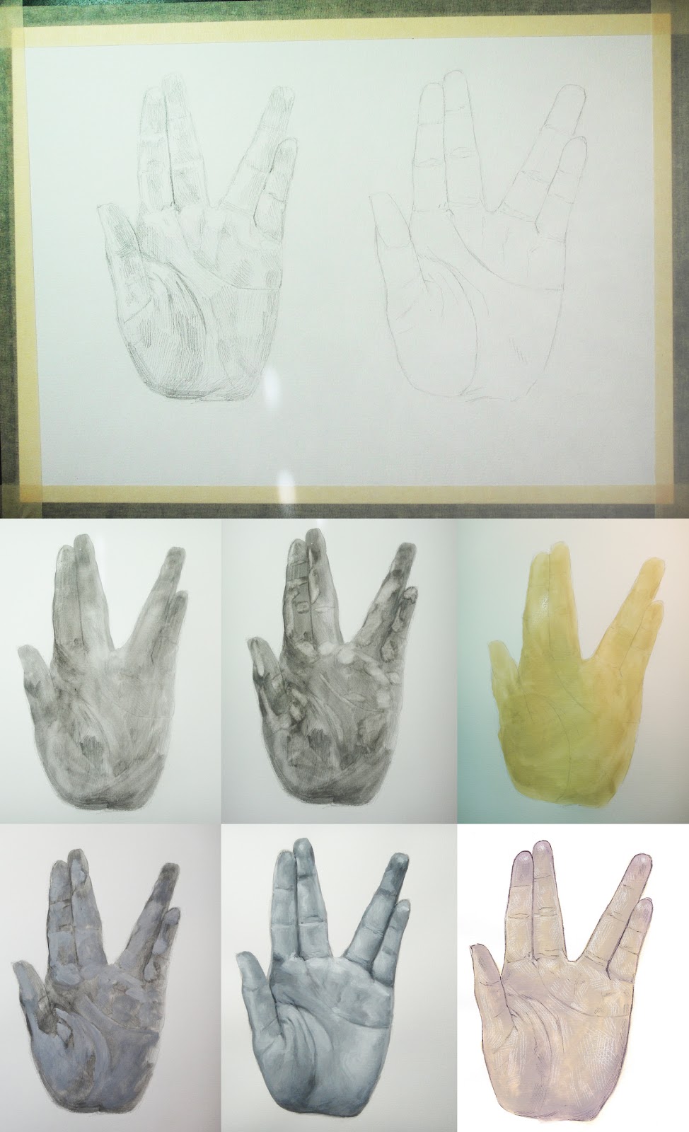
Yes, you are looking at the Vulcan salute. I wanted some more gouache practice, so I decided to do a hand. A hand in the Vulcan salute pose. Because I can.

It looks confusing at first, but in my picture, there are two separate hand studies where I explored two different rendering techniques. On the left is a semi-realistic approach, which called for creating a more detailed under-drawing. I spent more time than usual on the shading in hopes that I would be able to lay down the paint freely and accurately. This worked to a certain extent. With gouache, you have to build up a couple transparent washes before laying down heavier paint, which made it difficult to see the drawing. In the picture of the second wash, you will see some of the paint that I lifted in preparation for the lighter areas of the hand. This step was completely unnecessary as I could lay down light-colored opaque paint on top of the wash and it would be just as visible (3rd picture of grey wash). From there, I put down thick paint without blending. Once I had an area that had a full-range of values, I "blended" them very gently with a moist brush.

The hand on the right is more of an experiment with a rendering technique I am unfamiliar with. I painted a couple washes of light orange and then blended in to it some pinkish color. After the paint dried, I inked lines over it in pen, having to place the lines with few reference points as the opacity of the paint made my preliminary pencil work disappear. Next, I penciled in highlights with white charcoal pencil. This was fun, but it did not excite me quite as much as...

...this! I have been waiting for a while to combine traditional and digital media. I have seen it done  before and thought gouache would work well for the experiment. One big challenge with gouache is blending and mixing its vibrant colors. I thought, "But what if I work monochromatically and add color in Photoshop? That way, I can render my painting to my heart's content and have the flexibility to tweak the colors without having to re-paint!". Sure, it's not perfect. You get some grey in the mid to dark tonal range, but it's nothing that can't be fixed with practice. Let us look at it standing alone in all of its glory: